Web Content Accessibility Guidelines
The Web Content Accessibility Guidelines (WCAG) help web and software developers build pages that accommodate people with disabilities. Their aim is similar to the Americans with Disabilities Act (ADA), which creates rules for how public buildings in the United States must be built so that anyone can access them. The goal is to ensure that no one is barred from using the internet or a software because of a visual impairment, deafness, or any other disability.
Unlike the federally-mandated ADA, WCAG is just a set of guidelines—they're not legally required. Still, LoanPro agrees wholeheartedly with design choices they recommend and the inclusive spirit they foster. Our logo, after all, is the letters LP written in braille, signifying how LoanPro makes data visible. What's more, many of the WCAG's recommendations are just good design principles. Even if your vision is 20/20, no one likes looking at dark blue cursive text on a black background.
The WCAG guidelines are rather long, so we won't give a comprehensive explanation here. Instead, we'll highlight some of the major provisions and show how LoanPro lines up.
Color Contrast
Text and background need to contrast effectively. Black text on a white background is great, as are lighter colors on dark backgrounds. But light on light (light on light) or dark on dark (dark on dark) are hard to read.
Here's a typical page in LoanPro:
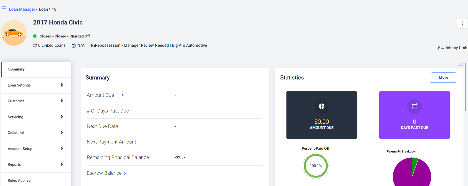
Most text is black on a white or light grey background. In the few places where we have colored backgrounds, we use white text.
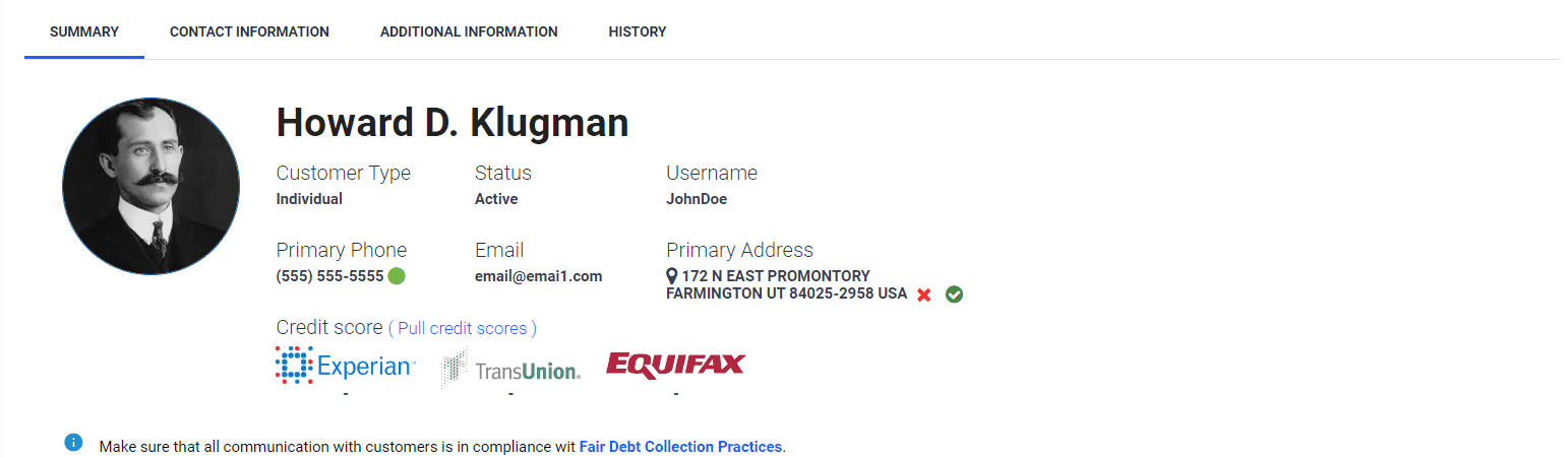
Font Readability
Just like how the color of text can make it more or less readable, so can the font. Simple, straightforward fonts are easy to read, but cursive fonts or the logos of death metal bands are sometimes completely illegible. LoanPro uses Roboto, a clean font that looks pretty similar to the one this article. Here's another typical page:
Whether it's in headings, paragraphs, pop-ups, tables, or anywhere else, the font is clear and readable.
Form Field Labels
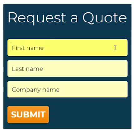
Websites and software should avoid putting the name of a field in the same place where you would type the actual value. Here's an example of what not to do:
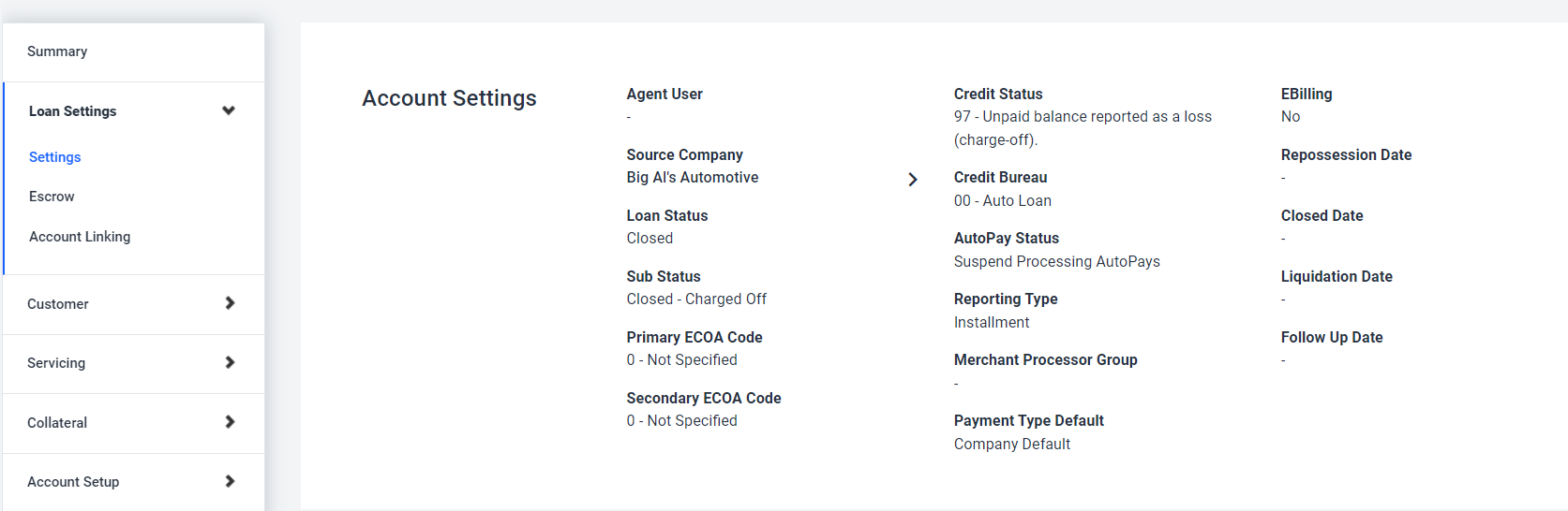
And here's how it looks when you're adding or editing information in LoanPro:
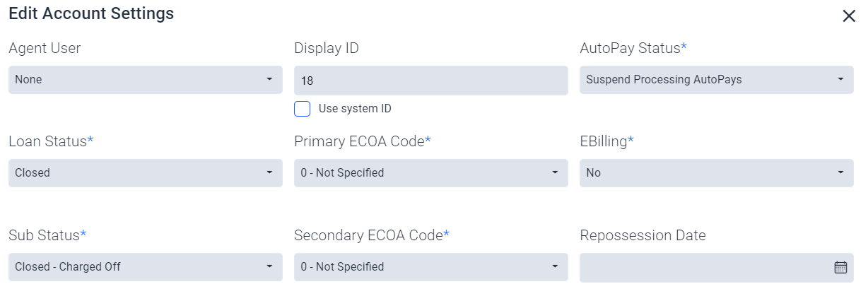
The name of the field (like “Loan Status”) is displayed above the field where you enter the actual data.
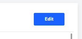
Descriptive Labels
If you use an image or icon, it's best to also have a descriptive label that appears when hovering over it. (This helps anyone who uses a device to read text from the screen aloud or display it in braille.) Here's an example in LoanPro:
When hovering over the camera icon, the text ‘Change image’ appears. You'll see the same kind of descriptive text when hovering over buttons:
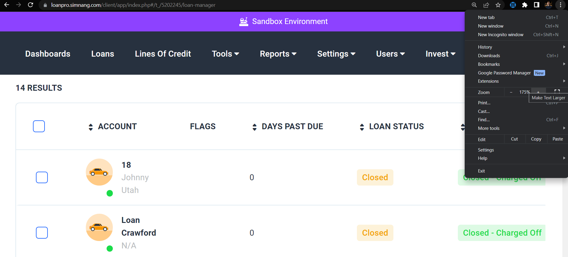
Adjustable Text
We recommend using LoanPro with Google Chrome, which gives you access to their built in zooming tools. Here's LoanPro zoomed into 175%:

Written by Jackson Stone
Updated on July 26th, 2023